

By Stephanie Mann //
I have always been fascinated by language, how we use it not only to communicate but also to express ourselves, to illustrate complex ideas. More than just a function of society, language is an art form all its own, in literature, film, theater, and music. Indeed, it even has a surprisingly rich history in visual storytelling, as seen in the work of artists across the world. In Chinese literati culture, painting and verse went hand in hand. In Islamic culture, calligraphy of the Qur’an is an art in and of itself.
Here are some examples of literature in art at Mia, including a work by Harriet Bart, who is featured in the exhibition “Harriet Bart: Artist Books + Works on Paper,” on view virtually and in-person at Mia through January 17.

Sunrise on New Year’s Day at Kanazawa by Totoya Hokkei, 1810s–1830s. Woodblock print (surimono); ink and color on paper. Gift of Louis Hill, Jr.
Located on the western coast of Tokyo Bay, Kanazawa Beach has long been known for its scenic beauty. This is a Japanese woodblock print that illustrates two poems praising the natural splendor of the region.
What I find so beautiful about this piece and its poetry is how the text so naturally fits in with the rest of the print. From the strokes of ink to the flow of the stanzas, it’s clear that the picture is painted not only through the artistic depiction of the sunrise but also through the verses that seem to rest along the sun’s rays.

Akashi Bay by Ike (Tokuyama) Gyokuran, late 1700s, Ink on paper sized with mica. Gift of the Clark Center for Japanese Art & Culture; formerly given to the Center by Mr and Mrs Makiji Hase.
Gyokuran depicts a Japanese scene of a well-known fishing village on a fan, combining text and image. Each line of calligraphy neatly stacks between the bones of the fan, following the object’s curve. In contrast, the painted strips of land jut across the fan perpendicularly with thicker, flatter strokes. The two art forms, painting and verse, come together harmoniously in the middle.
This is another example of text and painting working together so seamlessly that the two not only complement each other but read as part of a whole. The melancholy mood of this piece is set through the lyrical combination of the two art forms.

Manuscript of the Baharistan (Spring Garden) by Mir Husain al-Husaini and Mahmud al-Muzahhib (painter), 1551. Tooled and gilded leather, ink, colors, and gold on paper. The Katherine Kitteredge McMillan Memorial Fund.
This complete and finely calligraphed, illuminated, and illustrated copy of the Baharistan, or Spring Garden, by the Persian poet Jami, was produced in 1551 for Sultan ‘Abd al-‘Aziz, khan of Bukhara. The opening pages are typical of the ornate chapter headings, embellished script, and marginal decorations that frequently graced the Qur’an, as well as literary classics. They demonstrate a highly developed sense of design and an extraordinary virtuosity in the application of colors and gold leaf. The double-page illustration presents the encounter of Alexander the Great and a philosopher who delivers advice to rulers, a theme that is the principal concern of this section of the text. The rich colors and firm draftsmanship are characteristic of the Bukhara school. The artist who executed it, Mahmud al-Muzahhib, signed the composition Mahmud “the gilder.”

© Succession H. Matisse / Artists Rights Society (ARS), New York
The Poems of Charles of Orléans by Henri Matisse; author: Charles d’Orléans; publisher: Tériade, Paris, France; printer: Mourlot Freres, Paris, February 25, 1950. Color lithographs, letterpress.
Late in his career, Matisse worked on several illustrated manuscripts. In creating this one, he strove to fulfill two differing goals. On the one hand he wanted to visualize the courtly elegance of these late medieval poems and conceived of his edition as a modern painted manuscript. Matisse copied each poem in a handwritten script that emulates the poet’s late Gothic calligraphic style. On the other hand Matisse envisaged his illustrations in terms of a child’s workbook. By producing colored lithographic images, Matisse conveyed the spontaneous joy he experienced when reading the poems of Charles d’Orléans.

© Estate of Joan Mitchell
Poems by Joan Mitchell; author: Nathan Kernan; publisher: Tyler Graphics, Ltd., Mount Kisco, New York, 1992. Color lithographs, letterpress; portfolio.
Rain starts up and
You fall deeper
Into my arms
Then disappear.
Near the end of her life, Joan Mitchell was asked by legendary print publisher Ken Tyler to collaborate on a book project with the American poet and writer Nathan Kernan. Mitchell created a series of eight brilliantly colored abstract illuminations to accompany Kernan’s words.
What I like most about this piece is how the illustration is not a literal depiction of the poem, but rather a reflection of the imagery evoked by Kernan’s words. To me, this shows that two starkly different expressions of art can elicit similar reactions in the viewer, and, when set side by side, can paint an even more powerful picture.

Rondo: Miscellany of Visual Poetry by Harriet Bart; Collaborator: Mnemonic Press, Minneapolis; Collaborator: Hermetic Press, Minneapolis, 2006. Letterpress on Somerset paper; print edition, © Harriet Bart. Photo: Rik Sferra.
Rondo: Miscellany of Visual Poetry was originally realized as a site-specific public art installation commissioned by the Rondo Community Outreach Library in St. Paul. Twenty-two visual poems contributed by 15 national and international artists are etched into a 20-foot-long glass wall of the library, which is located in the historically African-American Rondo neighborhood that was all but destroyed in the late 1950s during construction of the I-94 Highway. The accordion-fold book replicates the completed glasswork.
This art piece removes the separation of words and illustration entirely to demonstrate a genre all its own: visual poetry. Described in an article by the Poetry Foundation, visual poetry concentrates on the meaning formed by the shapes of letters rather than the words themselves. It is written for the eye, yet its intentions are still always poetic. Visual poetry like this one can provide a challenge to the viewer who may be used to experiencing poetry in a linear way.
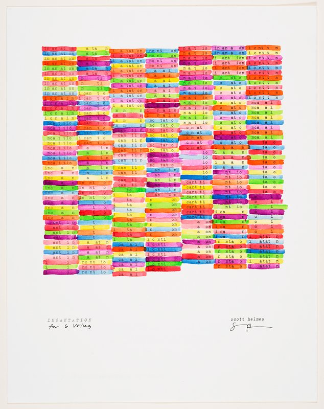
Incantation for Six Voices by Scott Helmes; publisher: Hermetic Press, Minneapolis, 2001. Typeset with hand-applied watercolor. Gift of the artist.
Scott Helmes is an internationally recognized contemporary artist, poet, and writer, and here offers another example of visual poetry. The formal arrangement of letters and words is as essential in conveying the intended meaning as more conventional elements of the poem, such as word meaning, rhythm, meter, and rhyming schemes.
What strikes me most about this piece is the equational essence of the poem that can be found in other work by Helmes, including found-object collage, mathematical poetry, and rubber-stamped poetry. The repetition of both letter and color creates a mesmerizing rhythm, made more powerful by the combination of text and painting.
Want to learn more about the relationship between literature and art and create your own masterpiece? Tune into this month’s Virtual Third Thursday: Discovering Book Arts on October 15 for a lesson with Minnesota Center for Book Arts.